Good Friday evening to all of you here on r/stocks! I hope everyone on this sub made out pretty nicely in the market this week, and are ready for the new trading week ahead. 🙂
Here is everything you need to know to get you ready for the trading week beginning March 6th, 2023.
Stocks close higher Friday, Dow breaks 4-week losing streak as 10-year Treasury yield retreats: Live updates – (Source)
Stocks rose Friday as Treasury yields eased from their recent highs and investors weighed the cumulative impact from Fed hikes already implemented and digested this week’s comments from the central bank.
The Dow Jones Industrial Average rose 387.40 points, or 1.17%, to 33,390.97. The S&P 500 climbed 1.61% to 4,045.64, and the Nasdaq Composite gained 1.97% to close at 11,689.01.
The yield on benchmark 10-year Treasury note dipped below the 4% threshold. Traders have been watching 4% as the key level on the 10-year that could trigger another down move in stocks. At times this week when the 10-year rate rose above that point, stocks retreated.
The 10-year Treasury is a benchmark rate that influences mortgages and car loans, so a breakout in the yield could ripple through the economy.
“The stock market is very sensitive to bond yields at this point and looking for some respite to the recent upward moves in yields,” said Yung-Yu Ma, BMO Wealth Management chief investment strategist. “There’s a nervous anticipation to upcoming data releases for jobs and inflation after the difficult readings last month. The market is unlikely to have sustained traction until data points resume a cooling trend.”
All of the major averages notched a winning week. The Dow posted a 1.75% gain and snapped a four-week losing streak. The S&P 500 closed up 1.90% on the week and its first positive week in the last four. The Nasdaq ended the week 2.58% higher.
Market sentiment got a boost Thursday after Atlanta Fed President Raphael Bostic said he thinks the central bank can keep its interest rate hikes to 25 basis points rather than the half-point increase favored by some other officials.
However, Fed Governor Christopher J. Waller struck a tougher tone in his comments to the Mid-Size Bank Coalition of America, raising the possibility of a higher terminal rate if inflation numbers don’t cool. He referred to January’s big payrolls report, which showed the economy added 517,000 jobs, as well as the latest reading from the consumer price index and personal consumption expenditures reports.
“If those data reports continue to come in too hot, the policy target range will have to be raised this year even more to ensure that we do not lose the momentum that was in place before the data for January were released,” Waller said.
This past week saw the following moves in the S&P:
(CLICK HERE FOR THE FULL S&P TREE MAP FOR THE PAST WEEK!)
S&P Sectors for this past week:
(CLICK HERE FOR THE S&P SECTORS FOR THE PAST WEEK!)
Major Indices for this past week:
(CLICK HERE FOR THE MAJOR INDICES FOR THE PAST WEEK!)
Major Futures Markets as of Friday's close:
(CLICK HERE FOR THE MAJOR FUTURES INDICES AS OF FRIDAY!)
Economic Calendar for the Week Ahead:
(CLICK HERE FOR THE FULL ECONOMIC CALENDAR FOR THE WEEK AHEAD!)
Percentage Changes for the Major Indices, WTD, MTD, QTD, YTD as of Friday's close:
(CLICK HERE FOR THE CHART!)
S&P Sectors for the Past Week:
(CLICK HERE FOR THE CHART!)
Major Indices Pullback/Correction Levels as of Friday's close:
(CLICK HERE FOR THE CHART!)
Major Indices Rally Levels as of Friday's close:
(CLICK HERE FOR THE CHART!)
Most Anticipated Earnings Releases for this week:
(CLICK HERE FOR THE CHART!)
Here are the upcoming IPO's for this week:
(CLICK HERE FOR THE CHART!)
Friday's Stock Analyst Upgrades & Downgrades:
(CLICK HERE FOR THE CHART LINK #1!)
(CLICK HERE FOR THE CHART LINK #2!)
End of Q1 Impacts March Trading
Julius Caesar failed to heed the famous warning to “beware the Ides of March” but investors have been served well when they have. Stock prices have had a propensity to decline, sometimes rather precipitously, during the latter days of the month.
Over the recent 21-year period, March has tended to open well with gains accumulating over its first three trading days. A brief bout of weakness follows before all indexes begin moving modestly higher into mid-month through month’s end.
March packs a rather busy docket. It is the end of the first quarter, which brings with it Triple Witching and an abundance of portfolio maneuvers from The Street. March Triple-Witching Weeks have been quite bullish in recent years. But the week after is the exact opposite,
In March 2020, DJIA plunged nearly 4012 points (-17.3%) during the week ending on the 20th. Solid late-March gains in 2009 and again in 2020 have improved average second half of March performance, but most bullish days are still in the first half of the month.
(CLICK HERE FOR THE CHART!)
Sentiment Back to Bearish
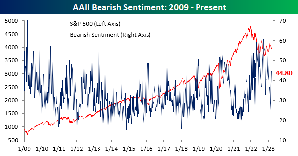
The consistency of declines throughout February and to start the month of March has sent sentiment decisively lower. The latest data from the American Association of Individual Investors (AAII) showed 23.4% of respondents reported as bullish, up modestly from 21.6% last week but still down significantly from 34.1% two weeks ago. With less than a quarter of respondents reporting as bullish, bullish sentiment continues to sit firmly below its historical average of 37.5% for a record 67 straight weeks.
(CLICK HERE FOR THE CHART!)
Meanwhile, bearish sentiment has continued to grind higher reaching 44.8% after three straight weeks of increases and hitting the highest level of the short year so far.
(CLICK HERE FOR THE CHART!)
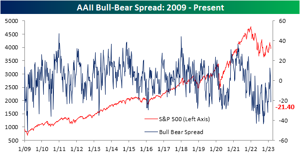
At the start of February, the bull-bear spread ended its record streak of negative readings as bulls finally outnumbered bears. The surge in pessimism in the past couple of weeks, though, has resulted in more negative bull-bear readings.
(CLICK HERE FOR THE CHART!)
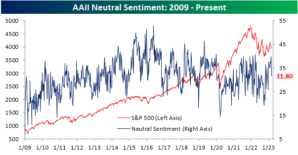
In addition to sentiment taking a more bearish tone, far fewer respondents are reporting neutral sentiment. After the highest reading in nearly a year last week, only 31.8% couldn't make up their mind this week. That eight percentage point drop from last week was the largest weekly decline since November.
(CLICK HERE FOR THE CHART!)
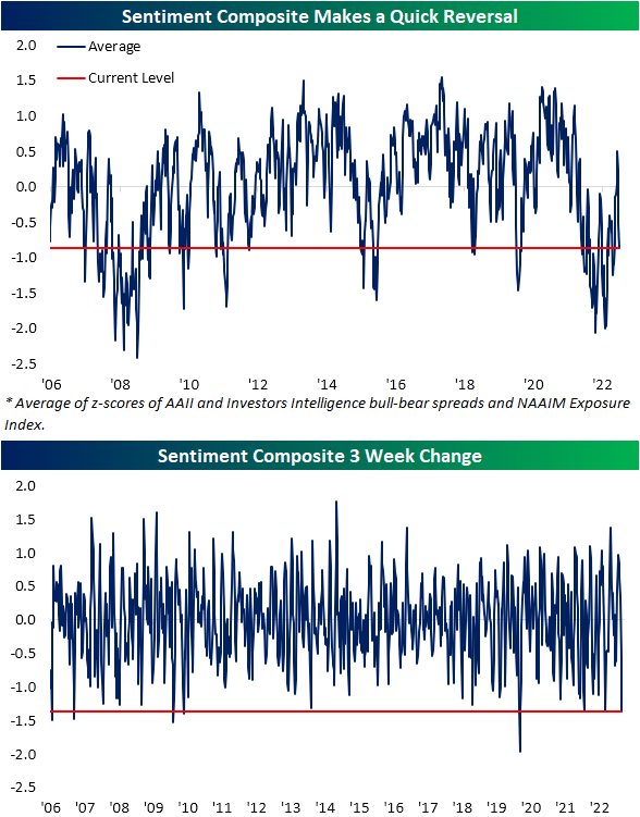
In addition to the AAII survey, other weekly sentiment readings have likewise made a quick reversal back towards negative sentiment. Combining the readings of the AAII survey with the Investors Intelligence survey and the NAAIM Exposure Index, sentiment has gone from the most cheery outlook in over a year down to pessimism right in line with the rest of the past year. In fact, the 1.36 point decline since the high three weeks ago ranks as the seventh largest decline in such a span since the composite begins in 2006.
(CLICK HERE FOR THE CHART!)
Since sentiment is a contrarian indicator, the sharp bearish turn across these sentiment indicators 'should' be a signal for positive forward performance. However, that has not exactly been the case historically. In the table below, we show each prior week that the index has fallen at least 1.25 points without having done so in the prior three months. Of the dozen prior instances, performance has been mixed going forward.
(CLICK HERE FOR THE CHART!)
Home Prices Falling Fast
Updated data on home prices across the country came out earlier this week when the newest monthly S&P CoreLogic Case Shiller indices were published. This data is lagged by two months, but it gives us a look at where home prices ended the year in 2022.
Below is a table highlighting the month-over-month (m/m) and year-over-year (y/y) percentage change in home prices across the 20 cities tracked by Case Shiller. It also includes the national and composite 10-city and 20-city readings.
Home prices fell sharply from November 2022 to December 2022, with the national index down 0.81% and 11 of 20 cities down more than 1% sequentially. New York and Miami saw the smallest m/m declines with drops of less than 0.3%.
Looking at y/y price changes, while the national index still showed an increase of 5.76% from December 2021 to December 2022, two cities have now seen prices dip into the red on a y/y basis. Seattle home prices fell 1.78% for the full year 2022, while San Francisco prices fell even more at -4.19%. Given the unrelenting pullback in prices over the last six months, we'll see more and more cities dip into the red on a y/y basis over the next few months.
(CLICK HERE FOR THE CHART!)
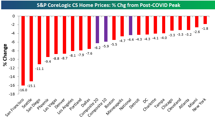
Where home price trends get interesting is looking at the post-COVID action. In the aftermath of lockdowns, government stimulus, and the shift to “work from home” in many parts of the labor force, home prices across the country absolutely soared. By mid-2022, the national home price index was up 45% from the level it was at in February 2020 just before COVID hit. Areas on the West Coast and in the Southeast saw prices rise even more, with many cities seeing gains of more than 60% at their peaks.
Prices finally peaked last summer, however, as rate hikes by the inflation-fighting Fed quickly pushed mortgage rates to levels not seen in decades. Below is a chart showing how much home prices have fallen from their post-COVID peaks seen in mid-2022. The composite indices are only down 4-6% from their highs, but we've seen prices really take a hit out west with cities like San Diego, Seattle, and San Francisco already down double-digit percentage points.
(CLICK HERE FOR THE CHART!)
Given the pullbacks in home prices over the past six+ months, below is a look at where prices currently stand relative to their pre-COVID levels at the end of February 2020. Notably, San Francisco — which has seen prices fall the most from their highs — is currently up the least since COVID hit with a gain of 23%. Other cities where home prices are up less post-COVID than the national indices include Minneapolis, DC, Chicago, and Portland. Where home prices are still up the most is in Florida as prices in Tampa and Miami are still up 60% or more.
(CLICK HERE FOR THE CHART!)
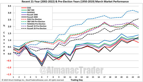
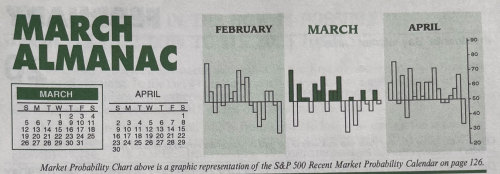
March 2023 Almanac: Even Better In Pre-Election Years
(CLICK HERE FOR THE CHART!)
As part of the Best Six/Eight Months, March has historically been a solid performing month with DJIA, S&P 500, NASDAQ, Russell 1000 & 2000 all advancing more than 63% of the time with average gains ranging from 0.7% by NASDAQ to 1.1% by S&P 500.
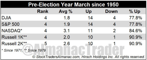
Historically a solid performing month, March performs even better in pre-election years. In pre-election years March ranks: 4th best for DJIA, S&P 500, NASDAQ, and Russell 1000 (January, April and December are better). Pre-election year Marchs rank #5 for Russell 2000.
Pre-election year March has been up 14 out of the last 14 for DJIA. Coming into 2019, the Russell 2000 had a perfect, 10-for-10 winning record, but is now 10 and 1 after falling 2.3% that March. Average pre-election year gains range from 1.8% by DJIA to 3.1% from NASDAQ.
(CLICK HERE FOR THE CHART!)
One of These Indices Is Not Like the Others
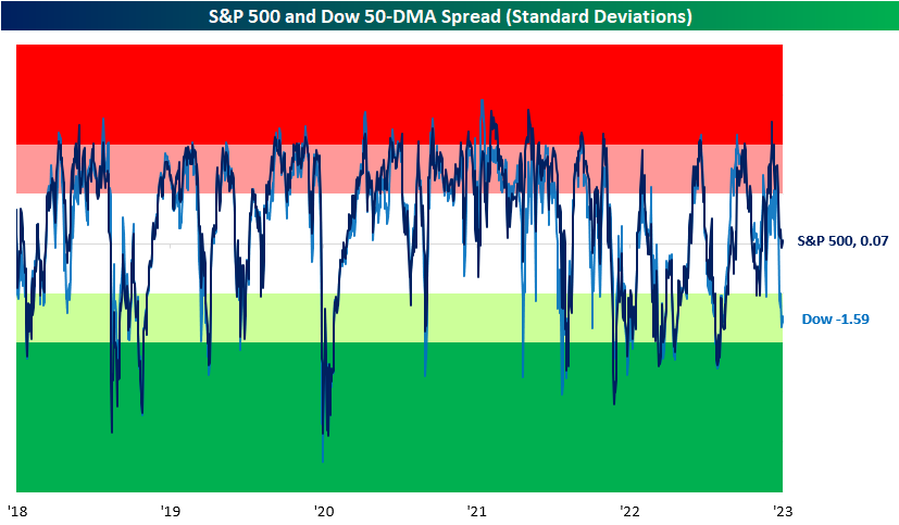
Looking across the major US index ETFs in our Trend Analyzer, one stands out (in a negative way) from all the others. At the moment, the Dow is the only major US index in the red on a year-to-date basis as we close the books on February. Even more notable, is the fact that it's also the only one below its 50-DMA. Not only is it below its 50-day, but it is trading firmly in oversold territory sitting over 1.5 standard deviations below its 50-day. Today that dynamic of Dow underperformance continues as the index is falling another 0.3% as of this writing while the S&P 500, Nasdaq, and Russell 2,000 are all higher.
(CLICK HERE FOR THE CHART!)
In the chart below, we show how far the S&P 500 and Dow are trading (in standard deviations) from their respective 50-DMAs over the past five years. For the most part, the two large-cap indices have tracked one another relatively well in spite of their differences in composition and price calculations. That makes the current situation in which the Dow is oversold without the same applying to the S&P 500 somewhat unusual, albeit not without precedence. While uncommon, there have been periods in which the indices have similarly distanced themselves from one another like most recently in the spring and fall of 2021.
(CLICK HERE FOR THE CHART!)
Although there have been other times in which the Dow and S&P's overbought/oversold readings have deviated from one another, the current example is abnormally large. With a gap of 1.66 standard deviations between the two indices' overbought/oversold readings versus their 50-DMA spreads, today's spread ranks in the bottom 1% of all readings since 1952 when the five-day trading week began. Additionally, such low readings have been exceptionally rare in the past 20 years. Outside of June and September of 2021, August 2015 was the last instance of the spread falling this wide with the Dow underperforming. Looking back even further, 2004 was the only other instance of the past 20 years.
(CLICK HERE FOR THE CHART!)
Tech Relative Strength Still Negative
Each day in our Sector Snapshot, we provide updated charts of the relative strength lines of each sector versus the S&P 500. Outside of a brief period last summer, Technology, the largest sector in terms of market cap, has seen its relative strength line sit in negative territory for nearly the whole of the past year. In other words, the broader market has outperformed the Tech sector almost every day for a year straight. In the chart below, we show the one-year relative strength line of Tech versus the S&P going back to 1991. After some of the most dramatic underperformance of the past couple of decades, Tech rebounded, and the sector has now only underperformed the broader market by a little less than 3% in the past year. While Tech's relative strength is not as weak as it once was and is closing in on the first positive readings since the mid-summer, today marks the 131st trading day of consecutive negative readings. That is handily the longest streak in nearly a decade and one of only six other times a streak has eclipsed 100 trading days.
(CLICK HERE FOR THE CHART!)
(CLICK HERE FOR THE CHART!)
The current streak has yet to come to a close, but in the chart below, we show the performance of Tech and the S&P 500 following the conclusion of each of those prior streaks of 100 or more days. Overall, performance does hold a positive bias with positive returns a vast majority of the time. That being said, the average size of those gains is not exactly impressive. In the case of Tech, the average and median gains are smaller than the norm across these time periods. One year out is the starkest difference with an average gain of less than 5% compared to what has typically been a gain that sits in the mid-teens. Likewise, the S&P 500 tends to underperform the norm one year later, but short to medium-term performance is stronger than the norm. Six-month returns, in particular, have been impressive with a move higher every time and an average gain that is more than double that of the typical six-month performance since 1991.
(CLICK HERE FOR THE CHART!)
Here are the most notable companies reporting earnings in this upcoming trading week ahead-
(CLICK HERE FOR NEXT WEEK'S MOST NOTABLE EARNINGS RELEASES!)
(CLICK HERE FOR NEXT WEEK'S HIGHEST VOLATILITY EARNINGS RELEASES!)
(CLICK HERE FOR MONDAY'S PRE-MARKET NOTABLE EARNINGS RELEASES!)
(T.B.A. THIS WEEKEND.)
(T.B.A. THIS WEEKEND.) (T.B.A. THIS WEEKEND.).
(CLICK HERE FOR THE CHART!)
DISCUSS!
What are you all watching for in this upcoming trading week?
I hope you all have a wonderful weekend and a great trading week ahead r/stocks. 🙂
Leave a Reply